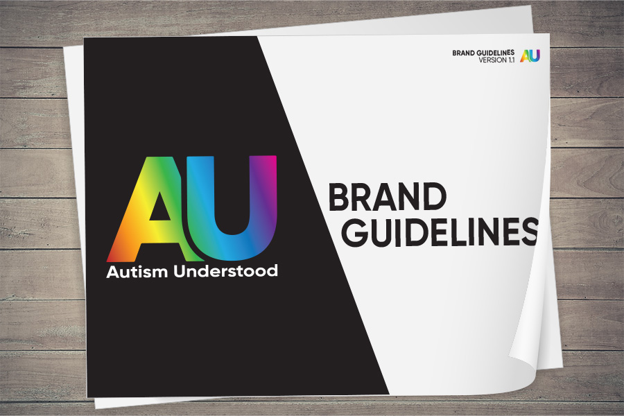
Working closely with charity Spectrum Gaming, I developed a sympathetic brand and guidelines to support a new online resource designed specifically for autistic young people – Autism Understood. The aim was to move away from the clinical, adult-focused tone typically seen in NHS or local authority materials, and instead create a brand that felt relatable, inclusive and sensitive to sensory needs. The result is a carefully considered visual identity – calm yet bold, engaging and youth-friendly – backed by detailed guidelines to ensure consistency across all touchpoints, while always keeping the lived experience of young autistic individuals at the heart.