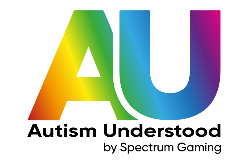
The Autism Understood logo was designed to reflect the energy, inclusivity and peer-led spirit of the platform – created by autistic young people, for autistic young people. Bright, vibrant colours transition smoothly across the bold “AU” lettering, symbolising diversity and the broad spectrum of neuro-diverse experiences. At the same time, the gradients were carefully tested to ensure they remain visually engaging without being overwhelming for those with sensory sensitivities. The clean, modern typeface and simple, spacious layout help with readability and accessibility. Overall, the logo avoids the clinical or overly formal feel of typical healthcare branding, instead offering something that feels positive, empowering and most importantly – understood.

