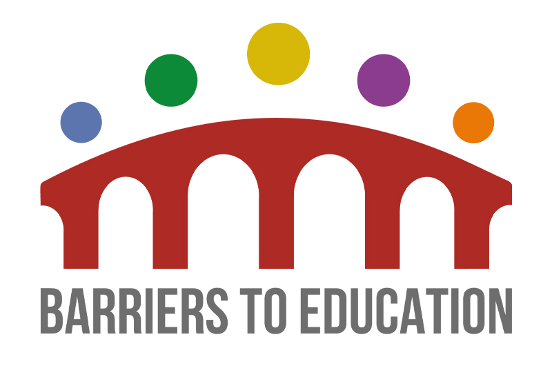
The Barriers to Education logo was created to visually represent the collaborative journey of helping children return to school after a period of absence. At first glance, the design forms a simple bridge – symbolising support and transition – but on closer inspection, it’s made up of five interlocking figures, each representing a key part of the support network: the child, parents, teachers, healthcare professionals, and social workers. The use of bold, distinct colours for each figure helps differentiate the unique roles and expertise each person brings, while also reflecting the varied and complex reasons behind school absence. The five circular elements moving across the bridge represent progress, movement, and the shared goal of getting the child back into education. The logo is warm, inclusive and optimistic – avoiding the cold, institutional feel of traditional education or healthcare brands – while still being professional and trustworthy.

