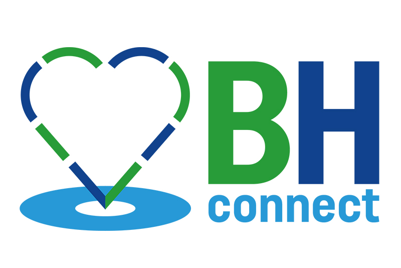
The BH Connect logo was designed to reflect the platform’s mission of linking local people with trusted businesses across the Bournemouth area. Taking inspiration from the familiar Google Maps marker, the logo features a location icon – but with a heart at its centre instead of the usual pointer. This simple twist adds warmth and a sense of community, reinforcing the idea that BH Connect is more than just a directory; it’s about real, human connections. The use of green and blue tones gives the brand a calm, trustworthy, and approachable feel, while still feeling fresh and modern. The logo instantly communicates location, connection, and care – perfect for a service built on helping people find the right support, right where they are.

