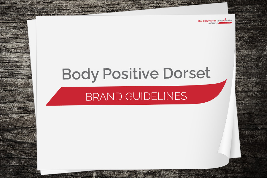
For Body Positive Dorset, the branding needed to reflect the professionalism, compassion, and trust at the heart of their work supporting people affected by HIV. The original logo was overly complex and didn’t translate well across digital and print platforms. The new brand guidelines introduced a simplified, modern logo that maintains the organisation’s identity while ensuring consistency and clarity across all media. The guidelines also show how elements of the logo can be used as graphical reinforcers throughout communications, helping to build a recognisable and cohesive visual presence that feels both credible and approachable.