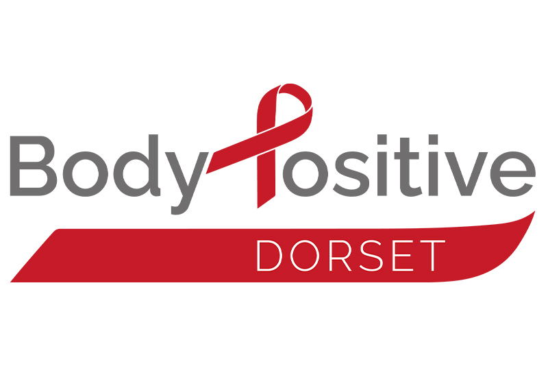
The Body Positive Dorset logo was designed to retain the recognisable symbolism of the red ribbon, long associated with HIV awareness, while modernising and simplifying it for clarity and flexibility across both digital and print media. By cleverly incorporating the ribbon shape into the “P” of “Positive,” the logo ties the symbol directly into the name, reinforcing the charity’s mission in a subtle but powerful way. A second ribbon forms an underline enclosing “Dorset,” helping to give the location prominence while also acting as a repeatable graphic device that can be used across wider branding. The original stark black text was softened to a deep grey, giving the logo a more approachable, less clinical tone – better reflecting the organisation’s supportive and inclusive ethos.

