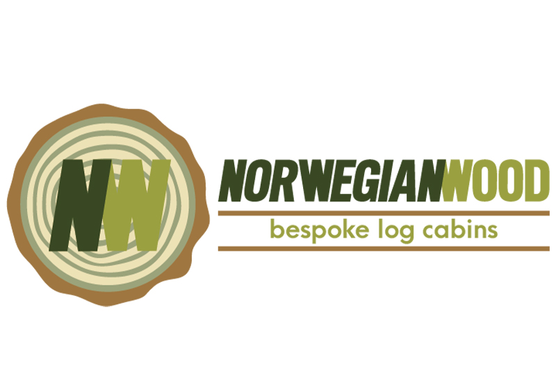
The Norwegian Wood logo was designed to reflect the craftsmanship, natural materials, and timeless quality at the heart of their bespoke log cabin builds. The earthy palette of greens and browns instantly evokes forests, timber, and the great outdoors, grounding the brand in nature. The typography is bold and all caps, giving the logo a strong, solid presence. The word “NORWEGIAN” leans slightly to the right, creating a clever visual link where the final “N” aligns perfectly with the angle of the “W” in “WOOD” – a subtle detail that reinforces the handcrafted, considered nature of the business. To the left, the icon resembles a cross section of a log, complete with tree rings, symbolising both longevity and sustainability. Within this, the initials “NW” mirror the distinctive letterforms used in the brand name, tying everything together. The phrase “bespoke log cabins” in lowercase beneath the main text softens the overall look, reinforcing the approachable, tailored service Norwegian Wood provides.

