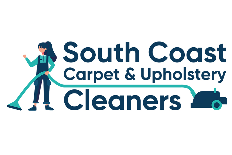
The South Coast Carpet & Upholstery Cleaners logo was designed to reflect the unique personality and professionalism of this woman-owned business, standing out in an industry traditionally dominated by men. The old logo felt dated and hard to read, especially given the length of the company name, so a fresh, more approachable look was needed. The new design centres on an illustration of a woman using a carpet cleaner – putting the owner front and centre and immediately challenging industry stereotypes. The hose from the machine cleverly sweeps through the text, underlining the company name and leading the eye to the cleaner itself, positioned in the lower right corner to complete the rectangular composition. The colour palette of dark grey-blue and soft teal strikes a balance between professionalism and warmth, while the bold, rounded sans-serif typeface improves legibility and gives the brand a friendly, trustworthy feel. Altogether, the logo is distinctive, personable and modern – perfectly representing the company’s fresh take on carpet and upholstery cleaning.

