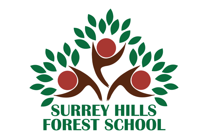
The Surrey Hills Forest School logo was designed to capture the spirit of outdoor learning, play and connection with nature that sits at the heart of everything the school offers. Using rich, earthy tones of green and brown, the logo forms the shape of a tree – an instantly recognisable symbol of growth, resilience, and the natural world. Look a little closer, and the tree’s branches reveal three joyful children, their arms raised as if playing or celebrating among the leaves. This hidden detail reflects the school’s ethos: learning through play, freedom, and exploration. Whether it’s for pre-schoolers, holiday club adventurers or educators in training, the logo represents a nurturing, inspiring environment rooted in the great outdoors. The company name is set in clean, all-capital lettering to ensure clarity and confidence, complementing the organic design with a professional and trustworthy feel.

