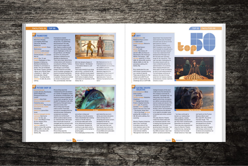
The design for this Facilities 50 Report was led by the image styling. We received many images from the various post houses to use in the article. However, the problem is, one post house looks very similar to the next and the images were of varying quality. By treating these images in Photoshop, I created a distinctive water-colour effect which helped differentiate these from the production stills which were also used in the article.
The main font used for headlines was deliberately a sripty style to complement the muted, hand-drawn water-colour effect.