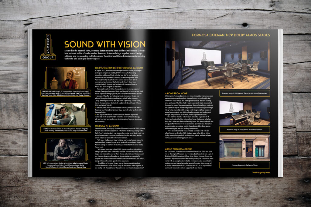
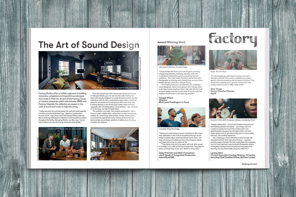
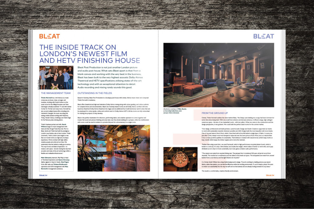
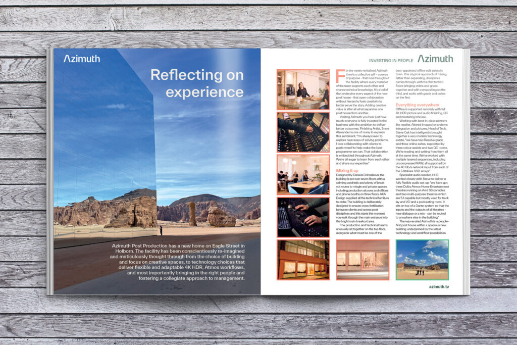
Vaudeville and The Finish Line are both in the same group of companies, but have very different brand styling. To create this eight-page advertorial feature, I made a point of pulling out the testimonials as if they were letters, reflecting the scriptive font of The Finish Line. The rest of the feature used a more regular sans serif font, as a nod to Vaudeville’s brand.
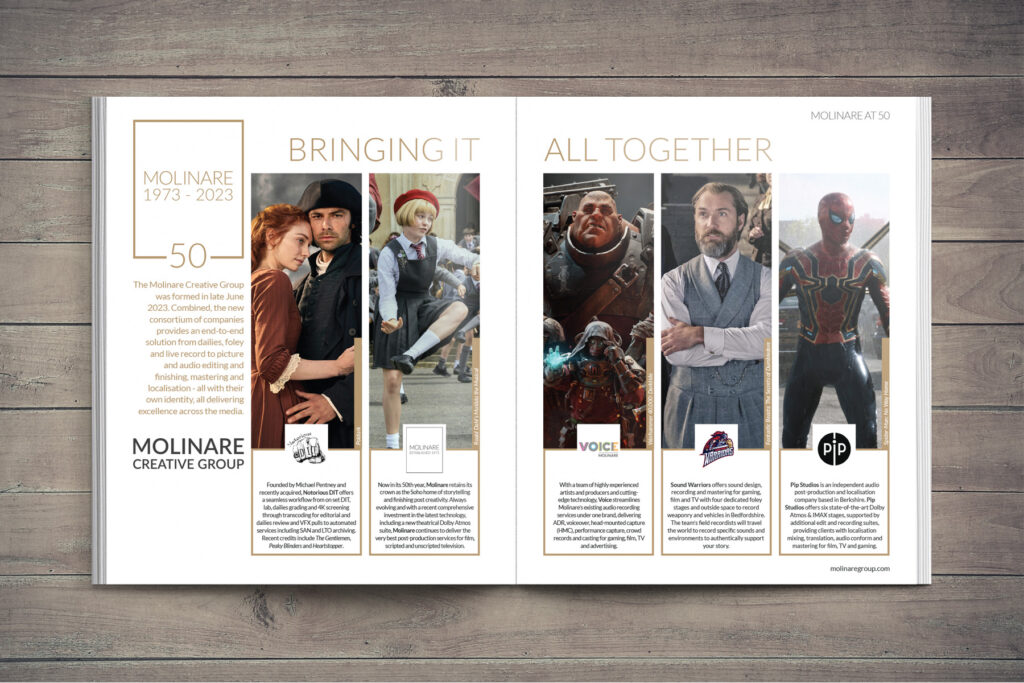
The imagery used was a combination of production stills, team shots and behind the scenes, showcasing the wide range of work the group of companies has done.