True Savings
As a home utilities broker, True Savings needed a bold, professional brand that felt trustworthy and modern. The deep purple, used as a core brand colour, is carried subtly through the three-circle logo and across supporting design elements, giving the brand a distinctive and cohesive look. While primarily used online, the branding was developed with […]
Body Positive Dorset
For Body Positive Dorset, the branding needed to reflect the professionalism, compassion, and trust at the heart of their work supporting people affected by HIV. The original logo was overly complex and didn’t translate well across digital and print platforms. The new brand guidelines introduced a simplified, modern logo that maintains the organisation’s identity while […]
Barriers To Education
The Barriers to Education project required a brand identity that could speak to a wide range of audiences – including parents, young people, teachers, healthcare professionals, and local authorities – while remaining approachable and easy to navigate. To move away from the formal, clinical feel of traditional education or NHS websites, the brand features bold, […]
Autism Understood
Working closely with charity Spectrum Gaming, I developed a sympathetic brand and guidelines to support a new online resource designed specifically for autistic young people – Autism Understood. The aim was to move away from the clinical, adult-focused tone typically seen in NHS or local authority materials, and instead create a brand that felt relatable, […]
ADD Property Finance
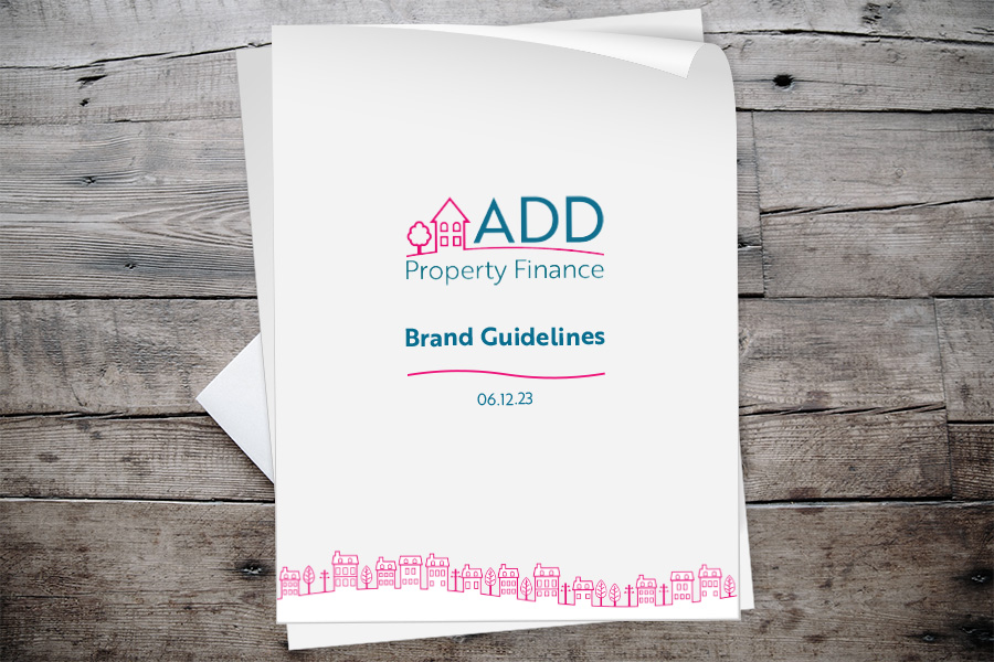
ADD Property Finance’s original branding felt overly corporate and lacked consistency across their materials. After taking the time to understand the company’s ethos and their move into the personal property finance space, I developed a new logo and visual identity that better reflects their approachable, straightforward nature. To support this, I created a comprehensive brand […]