The Creation of the Crown

The Crown was one of the biggest hots on Netflix, and to coincide with the launch of the sixth and final season, we ran a feature interviewing the various creative forces behind the series. The imagery we had been provided with was excellent so I ensured it was used to full effect throughout the article. […]
Making A Scene
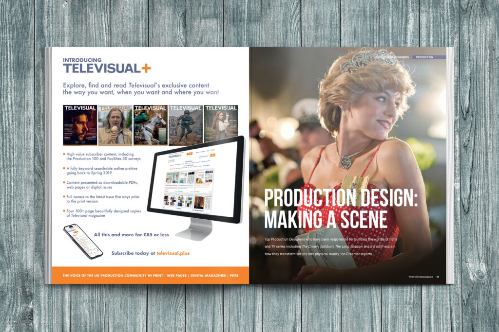
For this feature we broke the traditional boundaries of editorial and ran each section of the focus on well-renowned Production Designers across the spread, rather than giving them a single page each. Rich background colours were chosen to seamlessly run into the production stills provided. The overall look of the piece helped it to stand […]
Pitch Perfect
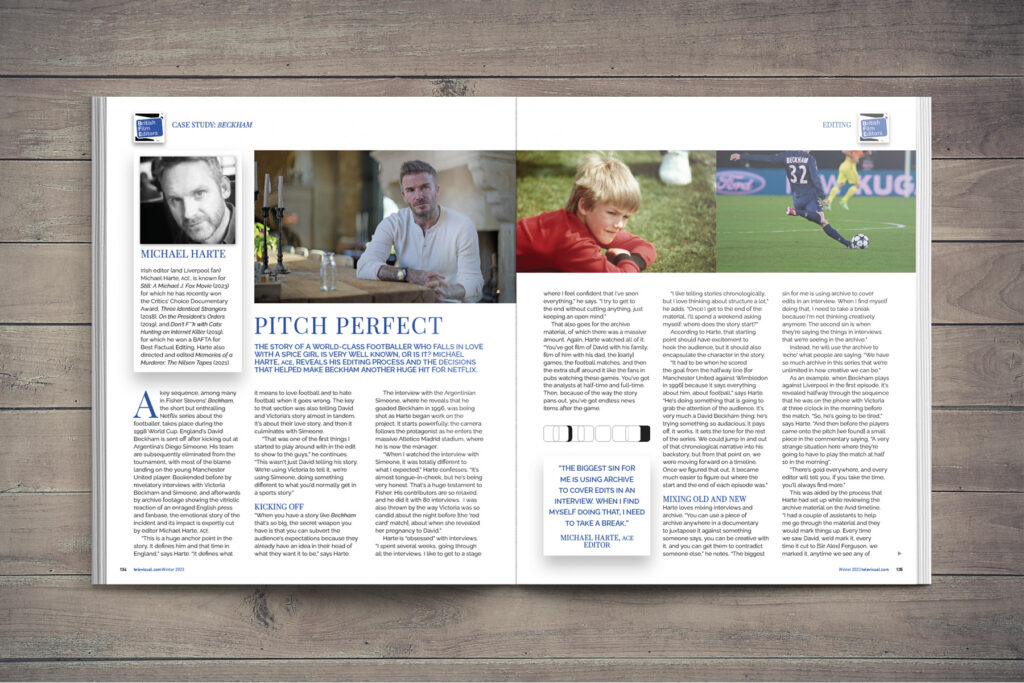
It’s not often you get to illustrate an article with photos of David Beckham, Sir Alex Ferguson, Tom Cruise and Will Smith! But in this feature about the editing behind the Netflix Beckham documentary, I made sure to give the images as much prominence as possible while keeping within the brand stylings of the British […]
Production 100
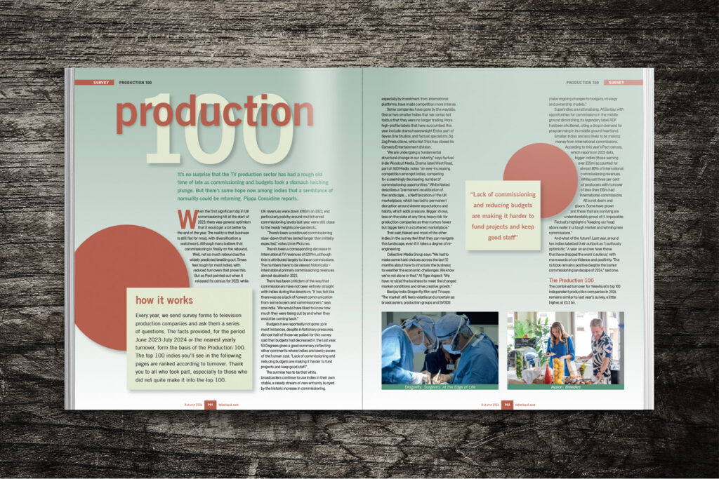
For this feature, it was important to have a vehicle in order to pull out multiple quotes, statistics and other box-outs. The brick red circles overlapping boxes with drop shadows allowed us to highlight the information and reflected the style of the primary logo/header. A rounded sans serif font was chosen for the header to […]
News Flash

Although a relatively simple piece of editorial, care was taken to use a font which was reminiscent (but not the same) as the one used along the bottom of television rolling news reporting. The solid deep red bars were also reflective of this well-recognised style.
Facilities 50 2023
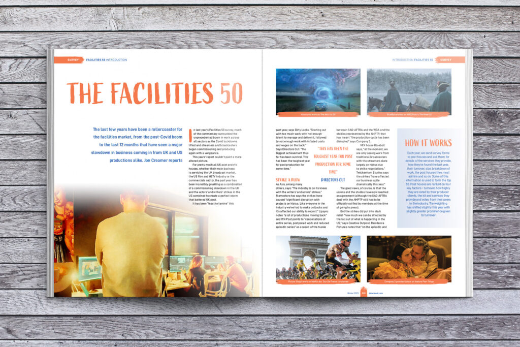
The design for this Facilities 50 Report was led by the image styling. We received many images from the various post houses to use in the article. However, the problem is, one post house looks very similar to the next and the images were of varying quality. By treating these images in Photoshop, I created […]
Facilities 50 Listing
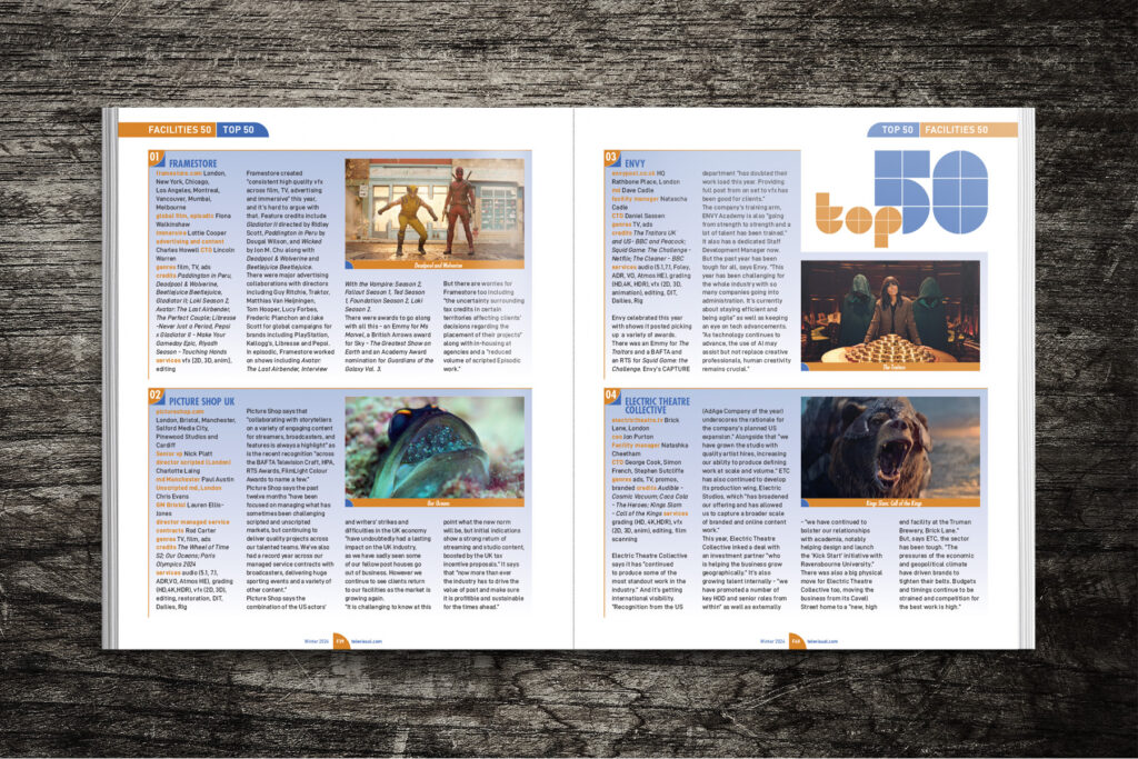
With all the regular reports in Televisual magazine, it is necessary to create a design which works within a listing page, as well as in the report overview. In this example, the bold orange and blue squares and quadrants I created for the main identity of the Facilities 50 Report, lent itself to the numbers […]
Entertainment Genre Report
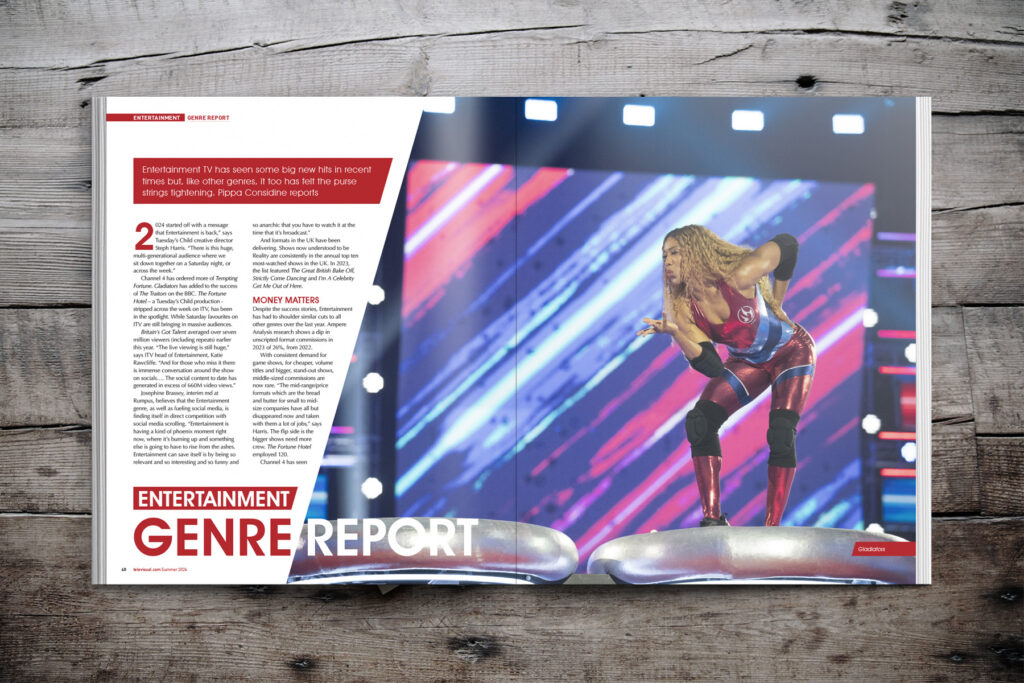
I developed a new style for this regular feature in Televisual magazine. The repeating angle is used to add interest to the imagery and pull-quotes and also acts as a vehicle to split the two words “Genre” and “Report”. It also means a very large image can be used on the opening spread without it […]
Next Generation Workflows
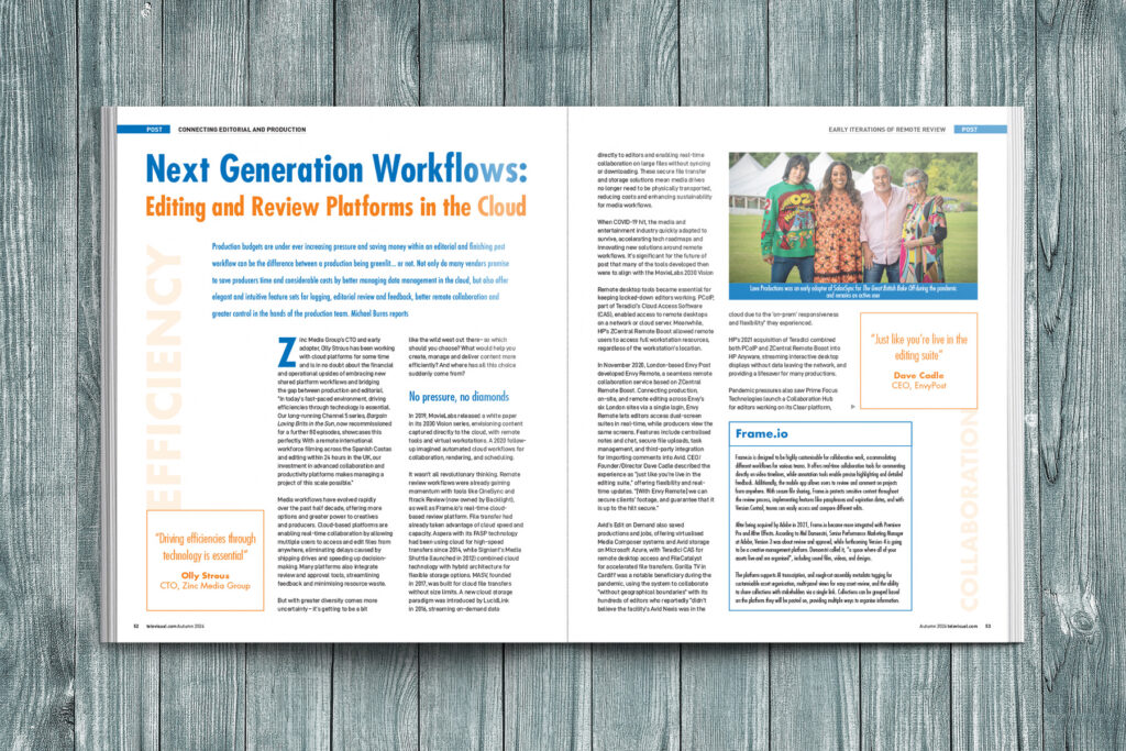
To help make this very text-heavy article more approachable, I boxed off the different sections and used large knocked-back typography to pull out some of the key words. The article was laid out in such a way to complement the associated advertising on the adjacent pages (three of which I also designed and artworked).
East Side Story
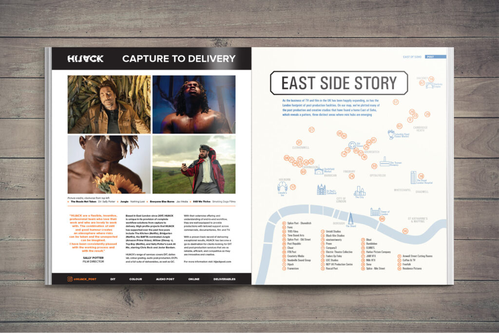
This feature ran over seven pages of the magazine and focused on the gradual migration of post production companies to East London. The article led with stylised map which showed the locations of all the post houses featured and included illustrations of famous landmarks as well. Drawing this map and ensuring everything was correctly positioned […]